A dashed outline draws itself, then fills: the bottle of water everyone pictures.
Picture a bottle of water. You surely see a clear plastic bottle with a blue cap, right?
What if it were a can?
What if I told you this black can is a bottle of water too? Does that throw you?
Liquid Death’s trick
That is the trick of the Liquid Death brand: putting water in metal cans, like an energy drink.
This example is not an endorsement of the brand: it only shows how the brand uses this effect.
An anomaly on the shelf
In the supermarket, every bottle is blue and they all look alike. This anomaly draws the shopper’s eye whether they like it or not: they pick up the can to see what it is.
Over a billion in seven years
With this trick, the brand passed a billion dollars in valuation in barely seven years: $1.4 billion in 2024, according to RetailBoss.
A principle: the Von Restorff Effect
The psychological law at work is called the Von Restorff Effect, or Isolation Effect, described by Hedwig von Restorff in 1933.
The brain filters out what looks alike
When everything looks alike, the brain filters it out, and focuses, whether you like it or not, only on the element that breaks the pattern.
In practice, in Figma
Let’s see how to apply this law in UX, to push conversion up.
Rule 1 · 60-30-10
First rule, the 60-30-10 of colours: in any interface, 90 % of the screen should stay calm, between the background (60 %) and the secondary elements (30 %). The accent colour never goes over 10 %.
The accent for one button only
Keep the accent for the single primary call to action, with a contrast of at least 4.5:1, the AA threshold of the Web Content Accessibility Guidelines: the eye goes straight to it.
Rule 2 · Spatial hierarchy
Second rule, spatial hierarchy. On a pricing page for instance, if you put three plans on the same level, the user hesitates.
Put the plan you sell forward
Break that symmetry and enlarge the card of the plan you want to sell: a little scale, a raised card, a drop shadow and a badge. You steer their attention straight to it.
Rule 3 · Visual noise
Third rule: avoid visual noise. According to the Nielsen Norman Group, when you put too many special elements on the same screen, the Von Restorff Effect loses its impact.
One screen, one goal
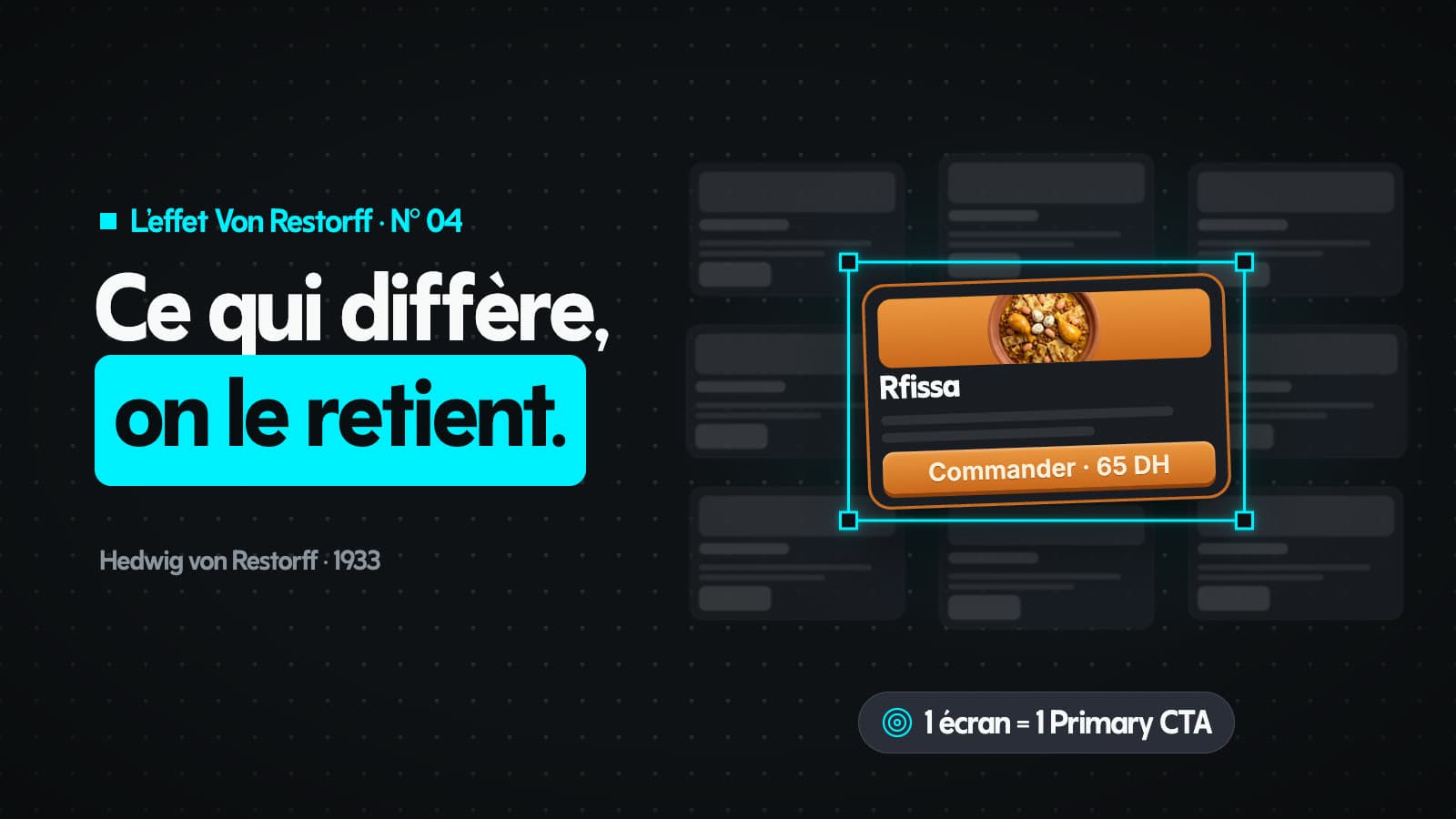
If everything catches the eye, nothing stands out. The golden rule: each screen has one goal, and one primary call to action.
The trace that remains
In short, the Von Restorff Effect rests on the trace left in memory once the app is closed.
This article covers episode N° 04 of our series on the UX laws. Next episode: Zeigarnik Effect.